The Wix Partner Awards shine a light on Glasgow designer Craig Hausman who shares his inspiration, tips and the secret to blazing a trail in the digital space.
Simplicity is the ultimate sophistication. While it’s a statement often associated with Renaissance art and innovation, it can just as easily be applied to modern design and marketing.
When we consider website design for brands, dynamic and exciting visual elements often catch our attention. But often, a simple, refined aesthetic that conveys a message with clarity and purpose yields the best results.
Hausman’s design philosophy and company motto: “clean, simple and sophisticated”
Striking a successful balance can present a dilemma for businesses, especially when the goal is to marry a clear and compelling brand with an easy-to-use experience.
This more refined approach to design also lends itself well to mobile, and with 62% of websites Now accessed via mobile devices, brands are advised to see less as more and ensure their sites are clear in their messaging, responsive and perform well in search engine optimization (SEO).
One web professional who does just that for clients is Craig Hausman, creative director and founder of Glasgow-based Hausman Graphics. This month, Hausman won the Wix Partner Award for superior functionality. We caught up with him to learn about the kind of design work that helped him achieve recognition.

Clarity in communication
Explaining his approach, Hausman says, “For me, it’s about whatever maximizes the goal of clarity of communication. This is the most important part of web design: communicating the business, the idea, the product, whatever. So how do you get it? Through clean lines and a sparse page, for example”.
The latest marketing news and insights straight to your inbox.
Get the best of The Drum by choosing from a range of great email briefings, whether it’s daily news, weekly summaries or deep dives into media or creativity.
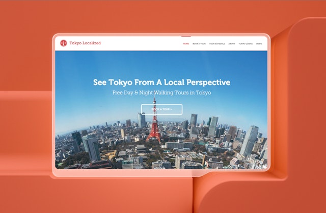
After completing his first website on Wix as part of a college assignment, Hausman launched his own design business with these principles at its core. It now relies exclusively on Wix for clients around the world, including a recent project for a Tokyo-based walking tour operator. Tokyo localized.
Hausman’s work for Tokyo Localized was recognized with a recent Wix Partner Award for superior functionality, highlighting his enthusiasm for projects where he is able to update existing websites and show clients the fruits of his labor through an “old” versus “new” revelation. He says, “I love the change and feedback from the customer when they see what they had to what they have now. It’s really rewarding.”
The original Tokyo Localized site was very basic and only ranked on page six of Google for Tokyo walking tours. Haussman’s main challenge was to make the site less busy. He explains, “There was too much going on at the site. So I said, ‘We really need to simplify this.’ We need to make it all about walking tours. We need to align with what the competitors are doing, but do better.” It was about how we presented the information in a very clean and accessible way.”
Hausman made the site visually striking with digestible content framed by white space and a strong brand identity brought to life by a newly designed logo. He emphasized the most important detail about the business, introduced themed and interactive images, original video, and used code to create a database for the travel booking page, all while providing a seamless user experience.
The end result is a testament to Hausman’s design philosophy and his company’s motto: “clean, simple and sophisticated.” This approach, which helped Tokyo Localized rank first on Google for “Tokyo walking tours,” has also been adopted by larger brands in their web designs. For example, Expedia, another brand that Hausman has advised on, updated its 70 websites and mobile app in 2021. The main goal, according to the online travel company, was to provide “a clear and simple design” that emphasized the product’s features for users.

The principles of simplicity
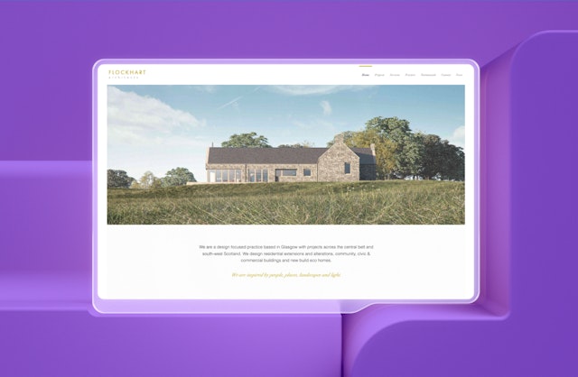
Based on his own vision and portfolio of work, which also includes Flockhart Architects i Mersi Solutions, Hausman has some clear ideas about how brands and their designers can embrace the principles of simplicity: “Not too much paraphernalia, not too much animation. It’s all very subtle. The color scheme is very muted because generally the images do the talking, so you don’t want any conflict.”
Hausman also says that a “good, simple typographic hierarchy” is important when it comes to complementing the aesthetics of websites. He adds: “There is nothing about my sites that appeals to you. You just want to communicate the core part of the business.”
Designers are being empowered to adopt approaches like this by clients who are generally better educated and aware of issues such as the importance of mobile responsiveness, load speeds and the desire to replace stock images with vector graphics. This growing sophistication on the part of the brand stems from the wide availability of witty online content, and Hausman expects his agencies and others to see this trend continue for the foreseeable future.
Positive progress on the part of the client can be reciprocated if the agencies know the client and their needs in more detail. As Hausman says: “Sure, you want a good portfolio, but they want business. This is what I have always tried to take into account in my work.”
Interested in learning more and joining the Wix Partner Program as an agency, freelancer, or designer? Then click here.

[ad_2]
Source link


